
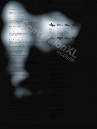
The picture below shows 3 different websites and where people look on them. Red indicates the area, where people looked the most, yellow areas got a bit less eye-action, blue areas got the least views and the gray areas, well, people didn’t focus on them at all.
As you can see, the more people scroll down, the more they lose focus and start mainly scanning your website. So always try to place the most important information in the top part of your website.
Here are the 15 facts you should know on how people view websites.
- Text attracts more attention than pictures.
- People start viewing your website from the top left corner.
- Readers ignore banners. Surprise, suprise.
- Fancy fonts are ignored.
- People only scan the lower parts of your website.
- Short paragraphs work better than long ones.
- Ads, that are placed on the top or left part of your website, get the most views.
- Ads, that are placed inside or below an awesome piece of content, get more views.
- Big pictures attract more attention than small ones.
- Also headlines draw attention.
- Visitors spend more time looking at menus and buttons than other parts of your website.
- Lists are better at keeping your reader focused than large paragraphs.
- Some people even completely ignore large chunks of text.
- White space is good!
- Menu works best when placed in the top part of your website.
+5 Facts on How People View Mobile Web:
- Reader’s attention is focused more on the top left corner of a screen.
- Keep your content short & simple. Reading long paragraphs needs concentration, which is something that mobile users don’t have.
- Users pay most attention on the top 2/3 of the screen.
- Mobile phone users absorb visuals more than text or content. (But if an image doesn’t supplement your content, you can do away with it).
- Short, but hard-hitting headlines draw more attention. Make your headlines count.
Sources:
https://www.dreamgrow.com/15-must-know-facts-on-how-people-view-websites/
BBC News | directcreative | GoogleBlog
Photo via Visual hunt
A great article which will help you design your website for maximum impact. Have you found this article helpful - please share your feedback in the section below.
No comments:
Post a Comment